Estimated reading time: 8 minutes
Red is a powerful color in photography, and it can be used in a variety of ways to create stunning visuals. In this blog post, we’ll be exploring some of the ways you can use the color red in photography. From using it as a primary accent color to utilizing it to evoke emotion or as a complementary color, we’ll also look at how to use red in perspective shots. By the end of this post, you should have a better understanding of how to use the color red in photography to create stunning visuals.
Table of contents
1. Red as a Primary Accent Color
Red is one of the most popular accent colors, and for good reason. It can be used to create an atmosphere of passion, power, and energy. Additionally, red can be used to add contrast and visual interest in photos. The eye tends to be drawn to the color red even from a distance, which makes it ideal for use as a primary accent color. While there are many ways to use red within images, we’ve outlined a few examples below.
Use it as backdrops, accents, or highlights. For example, you could add a splash of red to your photo as an interesting background or highlight. This will help to draw attention to the main subject of the photo and make it stand out from the crowd.
Another great way to use red in your photos is as an accent color. You can use it to add a pop of color that will help tie everything together visually. Plus, using different shades of red can create a variety of emotions in your photos – from excitement to anger!
Finally, one way that you could use red within images is by using it as text highlights or accents. By making sure that your text is highlighted in vibrant red, you’ll increase the readability and impact of your content right away! This technique can be used both indoors and outdoors – so there’s no limit on what you can do with this hue!
2. Utilizing the Color of Emotion
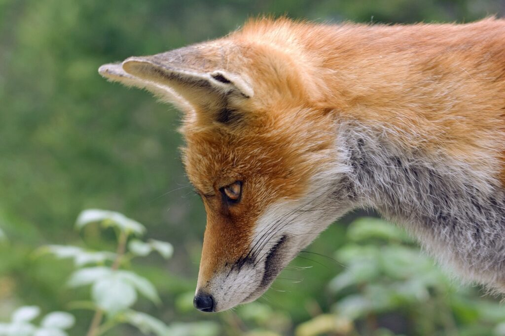
Are you looking to create powerful images that will communicate your message in a clear and concise way? If so, then you need to learn how to use red. This color is a strong and passionate one that can evoke intense emotions, which is perfect for creating visual stories that will resonate with your audience. By understanding color theory and the nuances of color psychology, you can use red in the most meaningful way possible to achieve the results you desire.
To start off, let’s take a look at what makes red such an effective color for imagery. Red is a primary color, which means it stands out against other colors on the spectrum. It has a high-intensity level, meaning it is both bright and bold. This makes it perfect for highlighting specific elements within your photos or videos while still staying within the boundaries of good taste. Additionally, red can be used to add contrast and drama to your images – something that will help them stand out from the crowd.
By expanding your knowledge of color theory, you can create even more interesting and powerful photos using red as an element. For example, learn how to use complementary colors together – something that will create stunning effects when paired with red. Additionally, explore triadic colors – combinations of blue, yellow, and purple – which are known for their rich visual effects. By understanding these principles in depth, you’ll be able to harness the power of red like never before!
Combining Color with Composition for Powerful Results
Color is one of the most important elements of photography, and understanding the psychology of red is essential for creating powerful images. Red is one of the most powerful colors in terms of its psychological effects. It is associated with energy, passion, and excitement, which makes it a great choice for images that need to capture a certain mood or feeling. Below, we will explore some tips on how to use red effectively in your photos.
One thing to keep in mind when utilizing red in your photos is that it should be used sparingly. Too much red can become overwhelming and detract from the overall image instead of adding to it. Try to use red only when it really adds something special to the picture – like adding depth or dimension or creating dynamic contrast.
Additionally, keep in mind the use of lines and shapes when working with red tones. By using these elements correctly, you can create striking visual effects that are sure to impress your viewers. For example, try using curved lines or edges to add depth and dimension to your images. Or try using simple shapes – like triangles or squares –to create striking visual effects that are easy on the eyes.
Finally, don’t forget about effective lighting when utilizing red tones in your photos. By adjusting your lighting appropriately, you can emphasize certain aspects of an image while suppressing others – giving you more control over how an image looks overall.. Experiment with different lighting techniques until you find one that works best for you! And once you have a strong grip on lighting basics, feel free to experiment with color further by incorporating different shades into your shots!
3. Red as a Complimentary Color
When it comes to color, red is one of the most popular choices. Not only is red a vibrant and eye-catching color, but it can also be used to create a striking contrast with other colors in your photo. When used correctly, red can help to draw attention to your photos and make them stand out. Here are some tips on how to use red effectively in your photos:.
1. Aim for sparse use of red alongside other colors in your photo. Too much red and your photo will look garish and over the top, while too little can leave you feeling lost or unoriginal. experiment with varying amounts of red until you find a balance that works well for you.
2. Use red sparingly as an accent or secondary color instead of using it as the main focus of the photo. When used this way, it will add vibrancy and punch without taking away from the rest of the image.
3. Combine different shades or tints of red together for interesting effects – think fiery oranges mixed with delicate pink hues for a unique look that’s sure to grab attention!
Finally, don’t forget about black! Black has a strong presence in both nature and fashion photography, so incorporating it into your photos can give them an edgy edge that’ll set them apart from others.
4. Using Red in Perspective Shots
Images are a powerful way to communicate your ideas and feelings. By using red in perspective shots, you can help to add depth and meaning to your images. Red is one of the most popular colors for photography, and for good reason. It has a range of different tones that can be used to create powerful compositions. Below, we will outline some tips on how to use red effectively in perspective shots.
To begin with, emphasize a specific part of the composition by creating shadows and contrasts. Use light sources that cast shadows on darker parts of the subject, or use darker tones to create shadows on lighter parts of the subject. This will help to create a more dynamic image that is focused on the focal point.
Next, use different angles to emphasize details and use red as a tool for visual communication. For example, if you want to convey anger or urgency in your image, shoot from an angle that makes the subject look larger than it actually is. By positioning yourself correctly and choosing the right lens and settings for your shot, you can create depth and perspective in your photo which will add meaning to your image.
Finally, color intensity and saturation can draw attention to the subject or establish the atmosphere and feeling in an image. For example, if you’re photographing a sunset over watercolor-painted boats, using saturated colors like red can help draw attention away from the boats themselves (and focus attention instead on the beautiful sunset). Choosing colors that are complementary together – like blue-green pairs – can also help establish moods or feelings within an image. By utilizing these tips effectively, you’ll be able to create powerful compositions that communicate what you want them to!
Conclusion
In conclusion, the color red can be a powerful tool in photography. From using it as a primary accent color to utilizing it to evoke emotion or as a complementary color, there are many ways that you can use this hue effectively in your images. Additionally, we have explored how you can use red in perspective shots by creating shadows and contrasts and adjusting angles and saturation levels. With these tips in mind, you should now be able to create stunning visuals with the power of red! So why not take some photos with this powerful hue today?
Note: If you want to make some adjustments to the photo just let me know. I can do it for you at a very low cost. You can hire me to edit your photos
latest post
- What is Midjourney
 Discover the capabilities of Midjourney AI, learn how to effectively utilize the platform, and explore the advantages and disadvantages of the Midjourney AI image generator across its different pricing options.
 - Brand identity elements
 In the vast marketing universe, imagery is pivotal in establishing and nurturing a brand’s identity. A brand’s visual choices are not merely aesthetic decisions but strategic moves that can significantly influence perception and performance. This Picfixs article explores the intricacies of selecting imagery that complements and enhances a brand’s essence, ensuring it resonates with the… Read more: Brand identity elements
 - 100 Best Mountain Captions and Mountain Quotes for Instagram
 Ready to scale new social media heights? Look no further than this treasure trove of 100 exhilarating captions and quotes, handpicked for your Instagram mountain posts!
 - Symmetry in Photography: A Creative Approach with Examples
 Delve into the enchanting realm of symmetry in photography as we showcase mesmerizing examples on our website. Experience the allure of perfectly mirrored images!
 - 11 Quarantine Photoshoot Ideas to Try at Home for Amazing Photos
 Looking for unique photoshoot ideas during quarantine? Explore the 11 creative suggestions that will help you capture unforgettable moments at home.